Dundee Design Festival
About
Big ideas take time to digest and so for our third year the Dundee Design Festival we’ve amended our approach to working in two year cycles. One year a huge festival and the following year an opportunity to reflect on the ideas that emerged in the previous year.
About the festival
2018 falls as a reflective year and as such the programme, Dundee Design Festival presents…has three core elements.
Factory Shop, Dundee Design Parade and PechaKucha Night TAKEOVER.
The Dundee Design Parade will be unlike anything that Dundee has seen before. A riot of colour and noise weaving its way around the city centre to celebrate Dundee’s place in the global family of UNESCO Creative Cities in this, Scotland’s Year of Young People 2018.
Dundee Design Parade is supported by the Year of Young People event fund, managed by EventScotland, part of VisitScotland’s events directorate.
Factory Shop
In partnership with Tilde Arts, Dundee Design Festival presents Factory Shop, a temporary exhibition and workshop space in the centre of Dundee.
One of the successes of the previous two festivals was how the event used design to reignite the vast former factory at West Ward Works into a potentially more sustainable cultural venue for the city. The UNESCO City of Design Dundee team aim to repeat some of this success by taking over a vacant high-street property in the city centre to bring you Factory Shop.
Factory Shop is an exhibition of prototypes and products made in factories by designers Dawn Youll, Florence Dwyer, and Tommy Perman & Simon Kirby. The exhibition marks the culmination of the first Dundee Design Festival ‘Factory Residency Programme’ launched in 2017 in partnership with Make Works.
The venue will also play host to several design-related events and workshops throughout the week exploring design alongside lots of hands on making and doing sessions.
Getting to the Festival by Road
Situated on Reform Street, visitors traveling by car should follow signage to City Centre and make their way to one of Dundee’s city centre parking options. The closest car parking to Factory Shop is West Bell Street Multi-Story, or the Overgate Car Park.
Parking for Blue Badge Holders is located on Reform Street itself.
Reform Street is a 5 - 10 minute walk from Dundee Train Station, and around 15 minutes from the Bus Station.
Reform Street is approximately three miles from Dundee Airport. Dundee Airport charters flights to and from Dundee between London Stanstead & Jersey airports and is situated only five minutes from Dundee City Centre. Flybe/Loganair operates a twice daily service to London Stansted at convenient times to suit business & leisure travel requirements.
Dundee is a main line station on the UK east coast line and has direct rail links to London and the continent. London is only six hours away by train and there are regular daily services that go direct to many parts of the country.
Reform Street is approx 10 mins walk from the Railway Station.
Our Sponsors
![]()

Brand Story
Lyall Bruce is a designer and partner at Agency of None. He designed the Dundee Design festival identity and shares some of his thoughts on the process of creating and evolving it year to year.
Re-visiting your work isn’t something that happens often, so to come back again to refresh the Dundee Design Festival identity this year was an interesting opportunity.
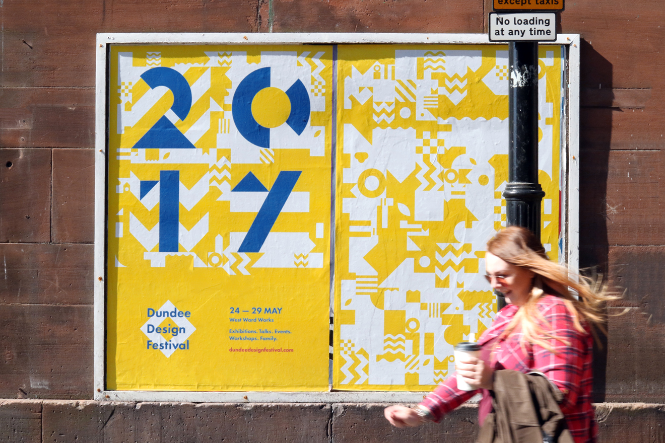
The original festival identity was designed as a one-off and was created as a woven pattern using the factory’s surrounding shapes and the colour palette from the printing presses that once resided within the space at West Ward Works.
In 2017 festival looked more generally at the factory floor and production within design, and for me that was good opportunity to evolve the ideas started last year rather than start from scratch.
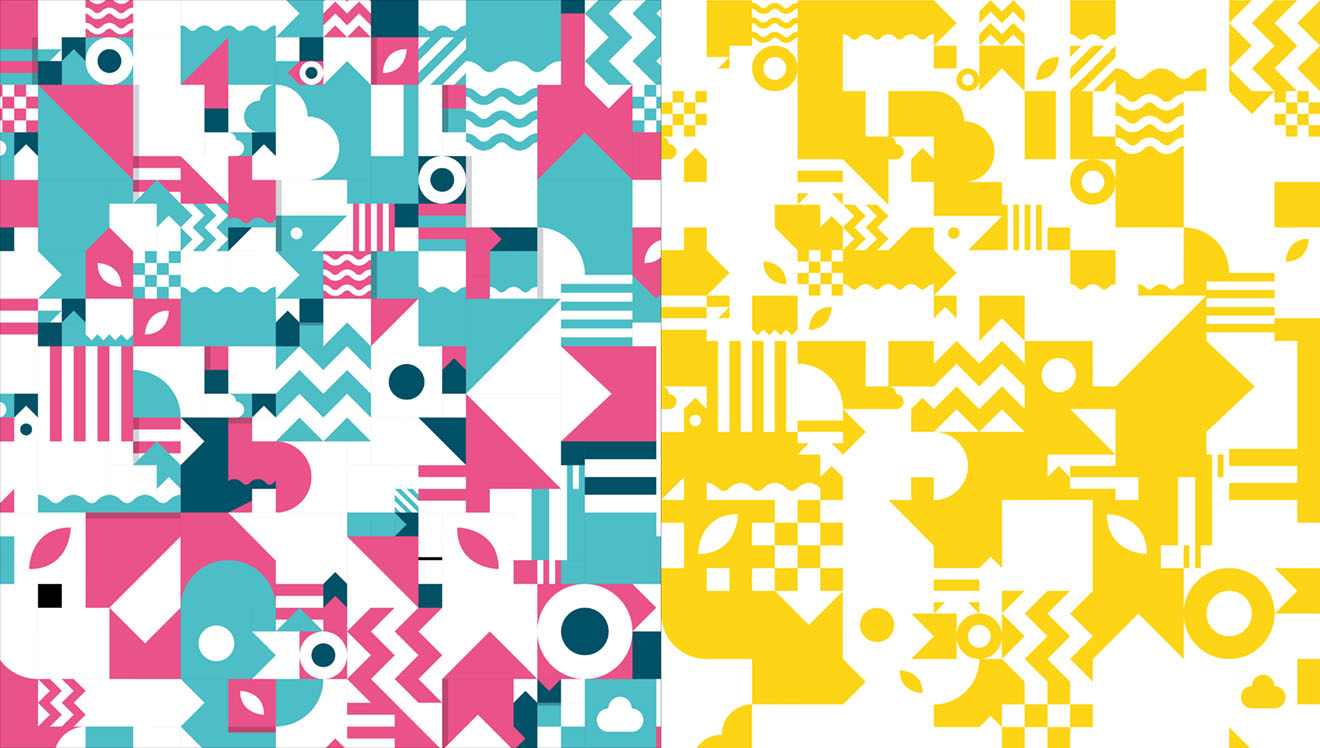
2016 Design Festival Pattern (left) and the reworked pattern for 2017 (right)
Moving things forward typographically
One of the areas that I felt was lacking the previous year was the typographic design work. I focused heavily on pattern and creating a pattern that would be recognisable throughout the festival that, in many ways, type was a bit of a distraction and inconvenience to the visual identity.
So for 2017 I wanted to swing that around and focus on type and how the pattern could evolve into a visual language. This began with looking at the shapes that were there and how these could be reconfigured to provide the foundations of letterforms.
I experimented with different levels of detail eventually settling on a minimal approach with each letterform made from 2 elements that took the legibility as far as I felt it was safe to go within the context of the eventual use.
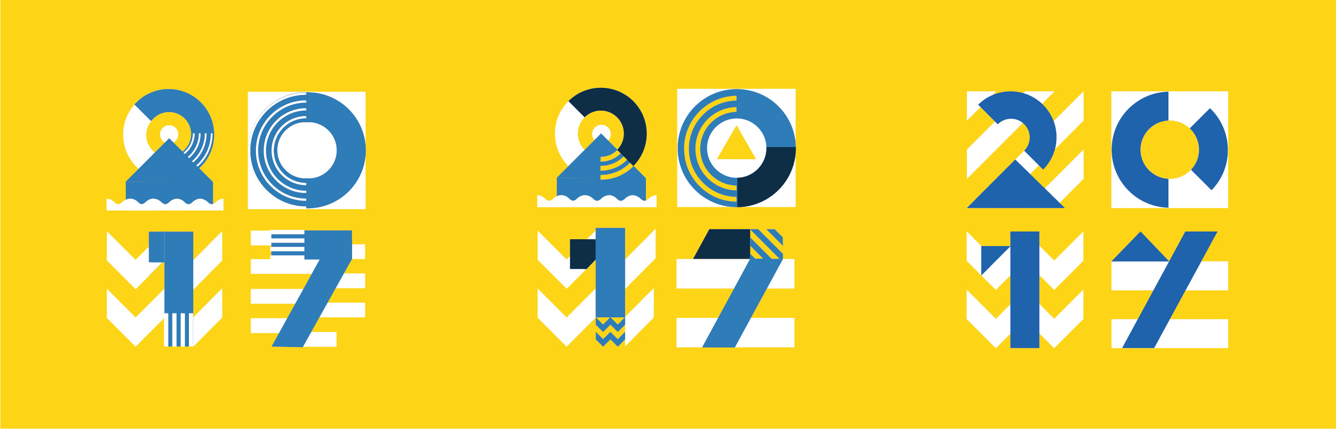
Development process of the 2017 identity letterforms
Choosing the right colour palette is very important to the overall design
For any identity project choosing the right colours is as much part of the design process as typography and visual design. Unless you are beginning the identity from scratch then most projects will already have a colour palette in place and sometimes a strong identity design can carry more than one colour palette option.
For the Dundee Design Festival, with it’s them based approach to the content, it made sense to approach the colour in the same way and look at how it could be used to reinforce the Factory Floor concept.
There is something really industrial about blue and yellow as a colour palette and once you see that association you begin seeing it everywhere! So this was easily the colour palette choice for this year. For me it was the yellow of the markings on factory floors and the blue of boiler suits, but it could easily have been the yellow of the machinery and the blue of the safety signs.
Application of the design ranged from posters through to screen and the colour had to work as spot colours, CMYK and RGB and the design had to be flexible enough to work across print, screen and for installation within the space.
Presentation needs to be considered carefully
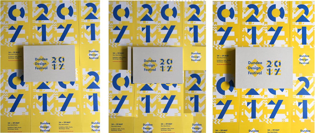
Process of creating images for promotional use – original image (left), Photoshop in progress (centre) and final image (right)
I was working on the promotional imagery quite quickly as the turnaround between completing the print runs and getting media coverage was small – we literally had to photograph on a smart phone and use photoshop to tidy the results.
Some of the images needed just simple colour and contrast tweaks and others needed a more intensive revisions. The most codex image was the combined image showing the invitations that were printed on GF Smith Gmund Urban Concrete card and the posters. The image that was sent to me was a nice composition but had lots of small areas that needed tweaked – this resulted in a complex photoshop adjustment with the shadow being cast the hardest thing to work around, you can see this in the image sequence above.
The exciting part of any identity design is seeing it in the wild and hearing people’s feedback. If you want to explore more of the design work that went into this years identity you can visit my project page on Behance or on my website.
There is also this article written by Creative Boom and you can access all the design elements over here if you want to experiment with the design yourself, or just look at how the digital files are constructed.
Design work for this project was created using the Adobe Creative Suite – particularly; Illustrator for all vector drawing, InDesign for poster layouts, Photoshop for image manipulation and Animate for motion graphics.